Mobile App
Red Cross Donor App
01.-
Context
Background
The Australian Red Cross is a humanitarian aid and community services charity in Australia and an auxiliary to government.
We were tasked to produce a production-ready native mobile app to help donors schedule appointments through their mobile devices.
I led the User Experience Design alongside a team of others which included UX Designers, the Product Owner, Tech Lead and multiple Engineers. Leading the experience design I was part of the process from the initial kick off meeting through to launch and iteration.
02.-
Objectives
Business Opportunity
Donor goals for the app
• Simplify the booking process for donors
• Provide ease of booking and tracking appointments
• Improve the overall % engagement
• Reactivate % of dormant donors
Operational goals for the app
• Reduce operational costs by limiting unnecessary calls and potentially the production of donor cards
• Reach eligible donors for urgent appeals by geography and blood type
• Send appointment reminders for decreased no-shows
• Improve delivery and effectiveness of blood service campaigns
03.-
Process
04.-
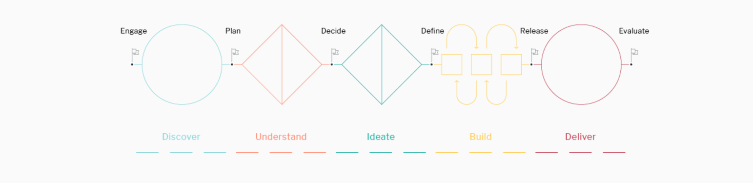
Discover
Design Workshops
Design thinking workshops uncover stakeholder wisdom, look for patterns and gather insights to inform the creation of a unique donor experience.
Setting the Stage-Divergence: Design thinking practice aresas, Service Map using behavioural change model, ethnography 101 Divergence: Ethnographic Research: interviewing
Insight Generation: Personas. Empathy Mapping. Persona Journey Maps
Iteration: Rough & ready prototype sprints, testing, prioritisation
Convergence: Feature review & roadmap, & annotate and build requirements
05.-
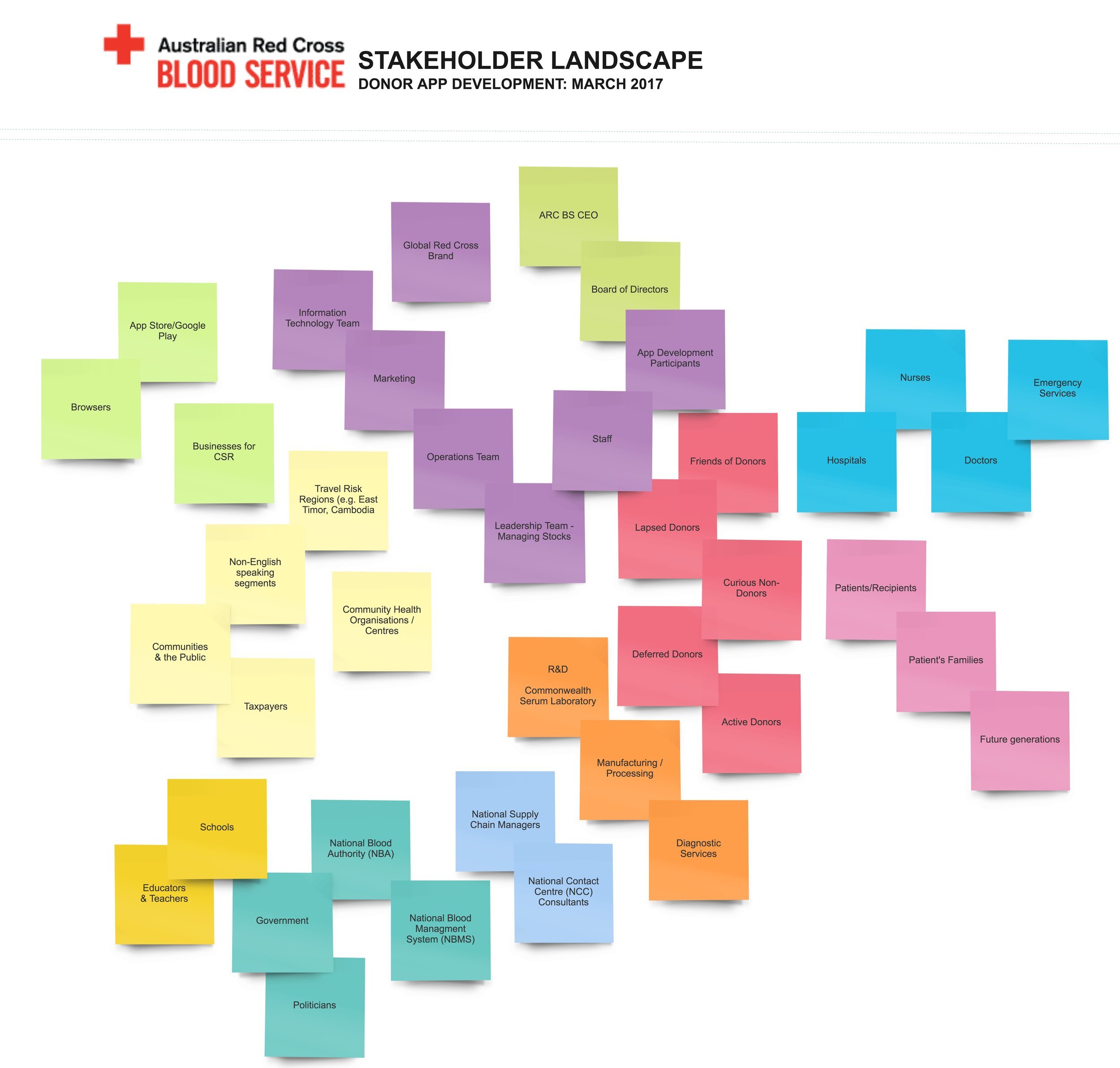
Understand
Stakeholder Map
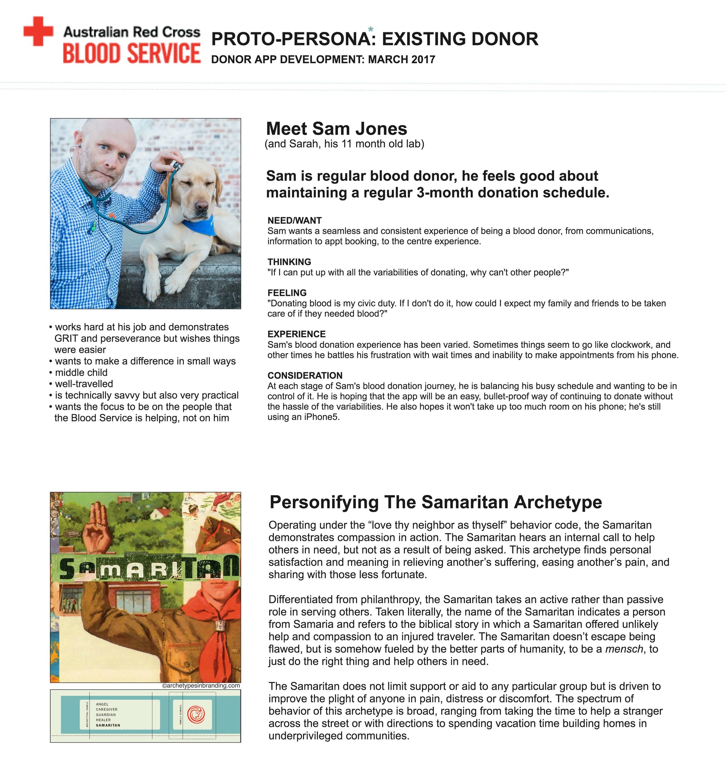
Persona
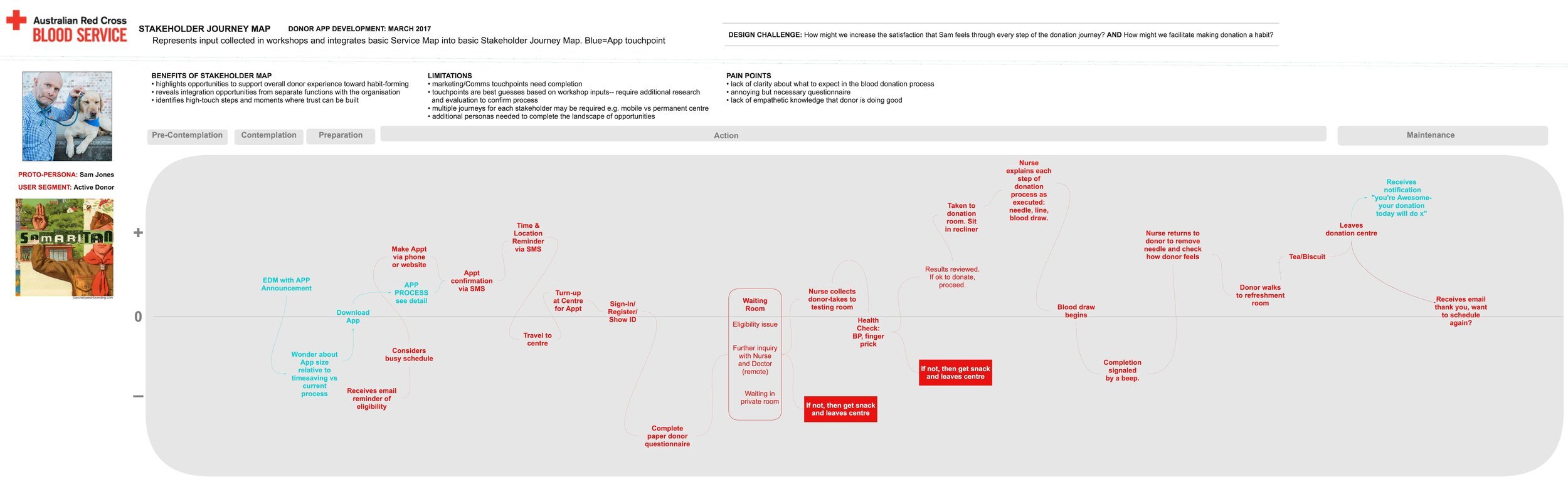
Customer Journey Map
06.-
Ideate
Concept Sketches
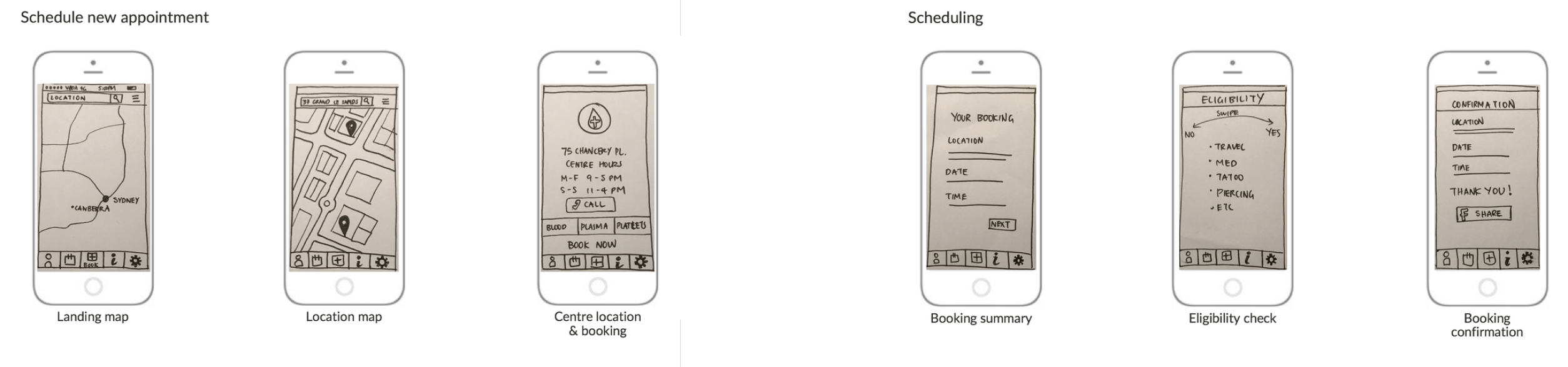
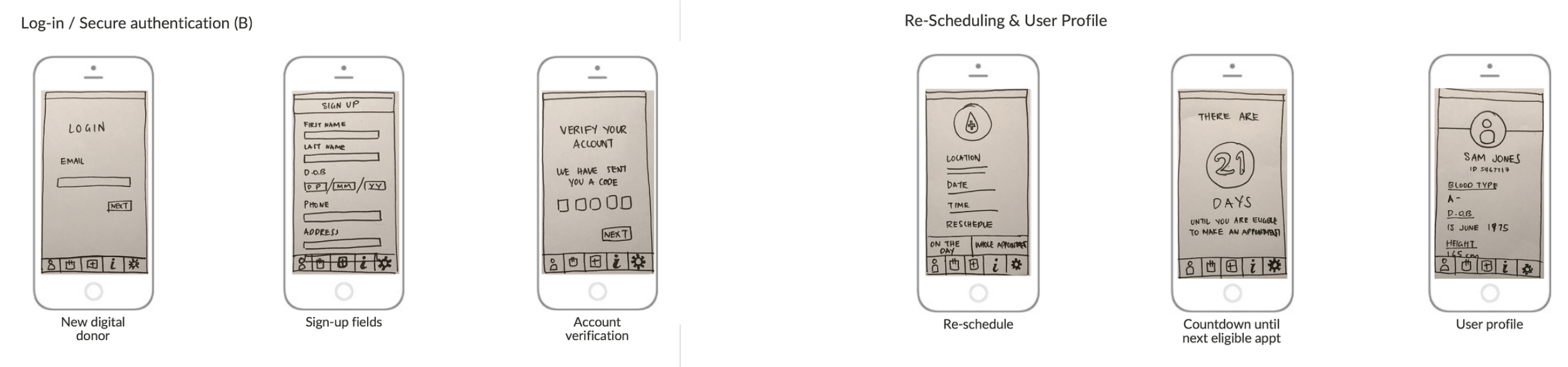
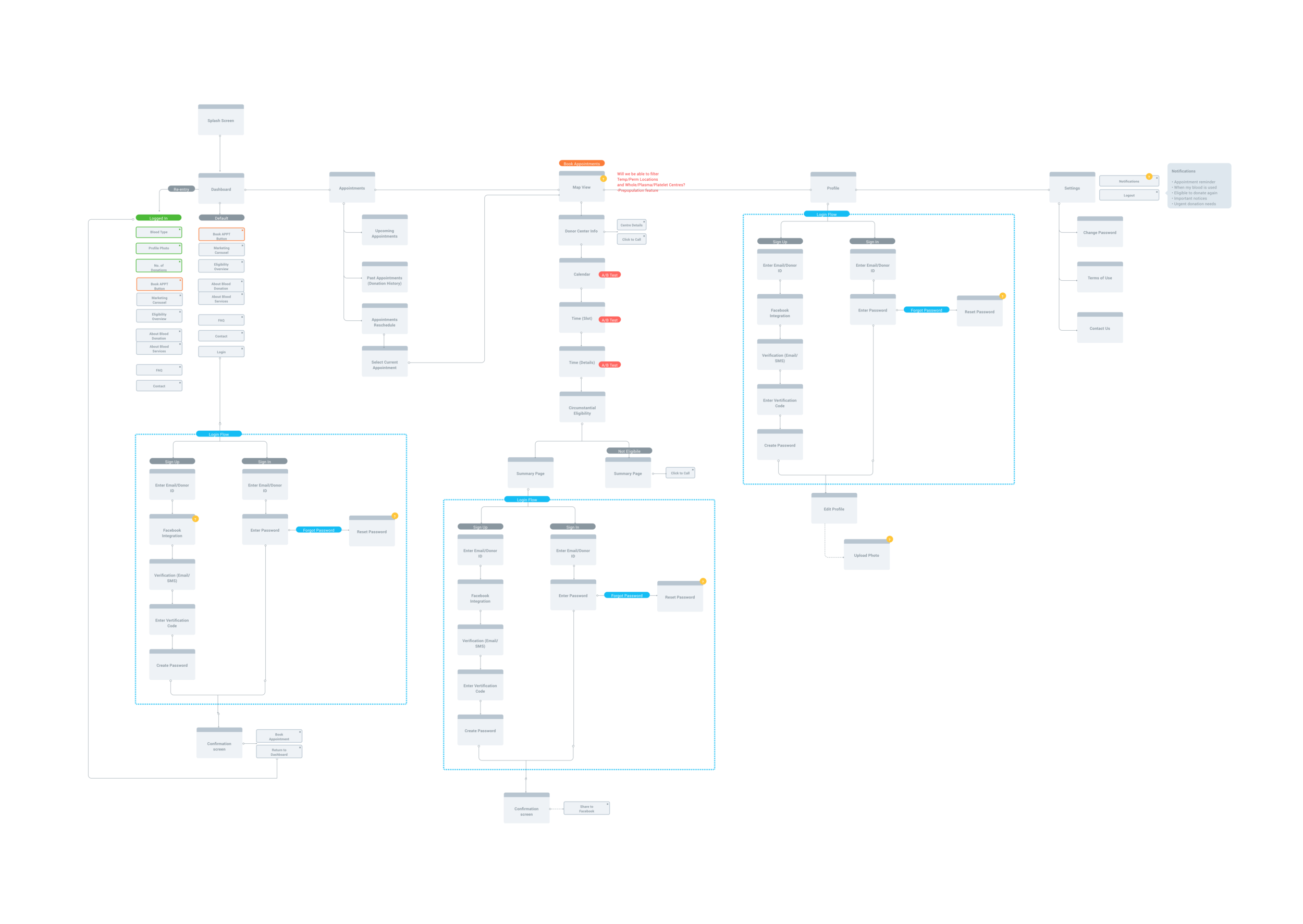
Donor App User Flow Architecture
07.-
Design & Test
Wireframing, Prototyping & Testing
User testing insights
• Increased clarity required on the purpose of the newsfeed/notifications functionality
• Remove the requirement to sign in, post the donor has downloaded the app and logged in or registered for the first time. We will allow the donor to access the app without the need to login for up to 90 days
• There is confusion around the interaction of the droplet icon on the dashboard
• Background images distract the user from completing bookings, it does not offer a lot of value and takes up valuable screen real estate.
User testing
• In the current flow the appointment process starts with either donation type selection or with DC selection. It then allows the donor to select date and time before answering the eligibility screen. This is annoying, if the donors is ineligible at this stage
• Need to communicate that rescheduling will cancel the existing appointment and that the donor will need to re-book appointment
08.-
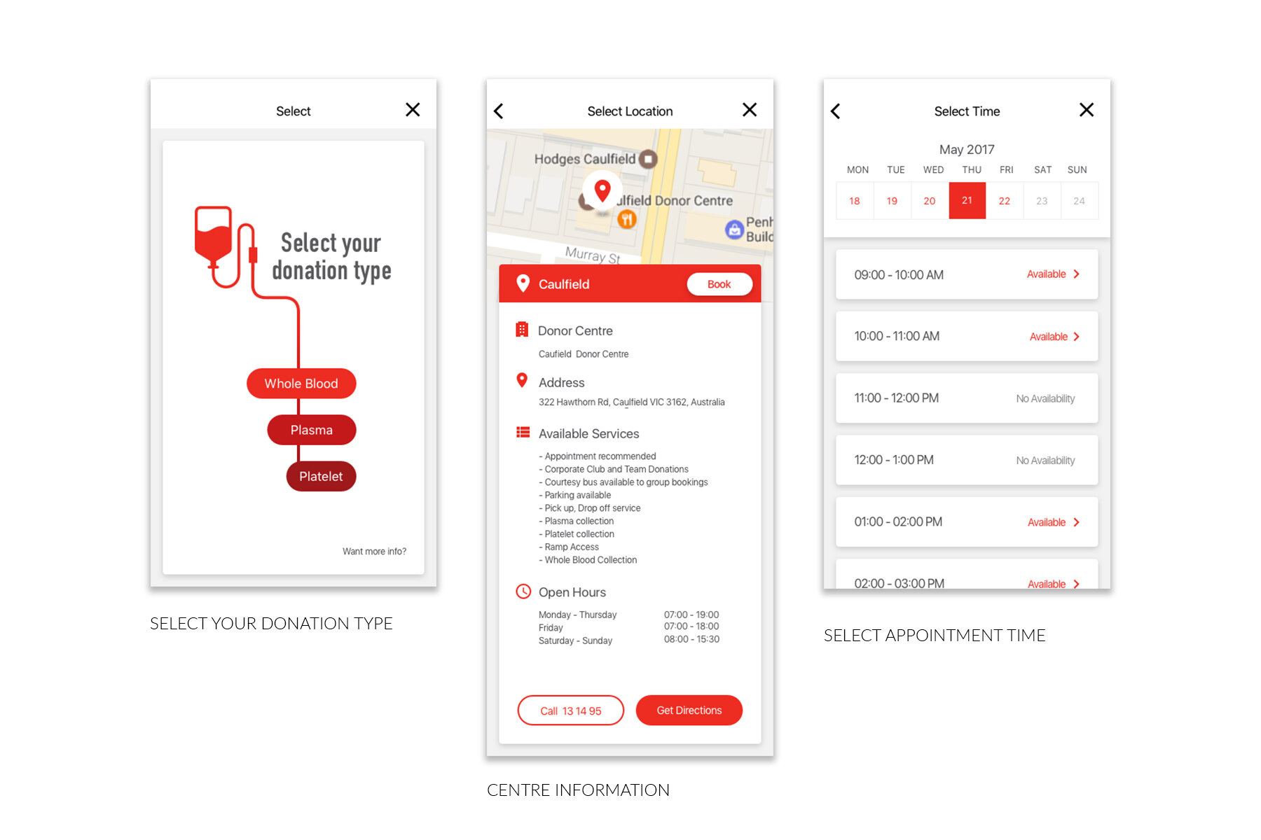
Build & Delivery
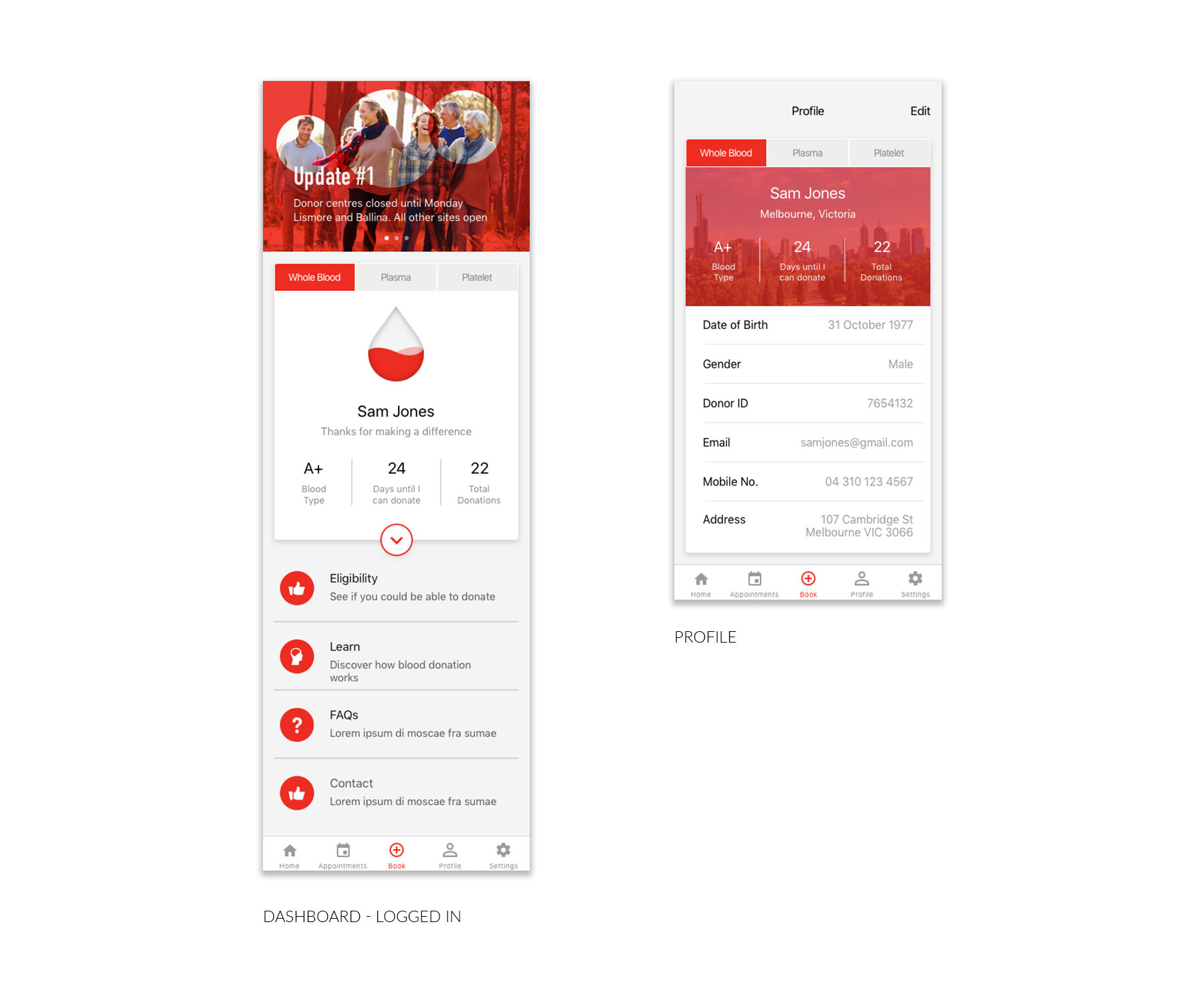
Final Design
09.-
Outcomes
Project Outcomes
March 2017
• Downloads have increased from 33,000 (30%) of donors after 4 months to 45,000 (41%) of donors after 9 months
• Red Cross Australia have 1,200 users/day
• Since launch they’ve gone from 3.5% to 15.7% of total appointment (peaked at 36% after a campaign), translates to a net reduction of 12% of all calls into call centre which has been a huge saving
• Mapping has been a major part of the apps success – visually seeing locations, where donors are in relation to centres/mobile donations
• Search – 3 ways available with list, search and map meets needs of all donor
• Push notifications – core reason to keep the app, particularly when blood is used to save a life
Download from Apple App Store
Download from Google Play Store